5 Tailwind CSS Best Practices for Preventing a CSS Nightmare

Tailwind CSS is a powerful CSS framework that can help you write CSS faster and more efficiently. However, with great power comes great responsibility. If you’re not careful, Tailwind CSS can quickly become a CSS nightmare.

In this article, we’ll share 5 best practices for preventing chaos in Tailwind CSS. By following these tips, you can keep your CSS clean, organized, and maintainable, even as your project grows.
1. Use fewer utility classes.
Tailwind CSS has a lot of great utility classes, but it’s important to use them sparingly. Too many utility classes can make your CSS bloated and difficult to maintain.
Instead, try to combine utility classes whenever possible. For example, instead of using mt-4 mb-4 to add top and bottom margins, you could use my-4. This will make your CSS more concise and easier to read.

This code does the same thing as the code below,

As you can see, the first code example is shorter and more concise. It is also more efficient because it only generates one CSS rule instead of four.
So next time you’re using Tailwind CSS, try to use fewer utility classes. Your CSS will thank you for it.
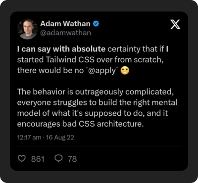
2. Don’t use @apply just to make things look “cleaner”.
Yes, you heard right! Don’t use @apply . It’s true that having lots of Tailwind classes in your HTML templates can look messy. But dealing with tons of custom CSS in a project is even messier. Using @apply for everything means you're essentially rewriting CSS and waving goodbye to Tailwind’s organized workflow and simple maintenance. It might even welcome a bad abstraction that has a high chance of causing technical issues in the future.

Here are some disadvantages of using @apply ,
- You have to think up class names all the time. Naming something that doesn’t deserve to be named is like trying to name the thing that keeps you up at night
- You have to jump between multiple files to make changes. This is like trying to find your car keys in a messy house. It’s a pain.
- Changing styles is scarier. CSS is global, so before you change that min-width value, think twice. It could break the whole site.
- Your CSS bundle will be bigger. I’m pretty, sure you never want this to happen.
Even the creator of Tailwind CSS, Adam Wathan has said that he regrets adding @apply and it’s the feature that causes them the most issues and they spend the most time debugging by far.
Now you might be thinking, “Then what should I do when I have to reuse the same style again and again?”.

As your project grows, repeating common utility combinations to recreate the same design in many different places is inevitable. For example,
If you need to reuse some styles within a single file like the above example, multi-cursor editing, and loops/maps are there to help.

If you need to reuse some styles across multiple files, the best way is to create reusable components for each element. A reusable component is a piece of code that can be used multiple times in your application. It can be a simple button, a complex navigation bar, or anything in between. Creating such components is possible if you’re using a front-end framework like React, Svelte, or Vue.
You can learn even more about reusing styles from the Tailwind CSS Documentation.
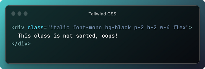
3. Keep your class ordering consistent
Keeping your CSS class ordering consistent is like putting away your laundry. If you just throw everything in the drawer, it’s going to be a mess when you try to find something later. But if you fold everything neatly and put it in the right place, it will be much easier to find what you’re looking for.
The same is true for your class ordering. If you just throw utility classes on an element in no particular order, your styles are going to be difficult to read and debug. But if you keep your class ordering consistent, your CSS will be much more readable and easier to maintain. So, don’t be that guy who just throws everything in the drawer!

Let’s look into an example,

Here are two perks of keeping your tailwind class ordering consistent,
- Easier to spot conflicting classes. For example, if you always put breakpoint modifiers first, element modifiers next, and layout modifiers last, it’s easy to see if you have a conflicting class like
md:mt-4 mb-4. - Makes code review way easier. This might be helpful for you to review your own code and even when you’re working on a team, other developers can quickly scan your code and understand what it’s doing.
You’re probably thinking, “How can I order these classes? It looks like it will take a lot of time and effort!” But don’t worry, there’s an easy way. Keep reading, and I’ll reveal the secret at the end.
4. Design tokens are your best friend.
Design tokens are a way to store and manage your design variables, such as color palette, spacing scale, typography scale, or breakpoints. With design tokens, you can create consistent and reusable styles that are easy to update and maintain.
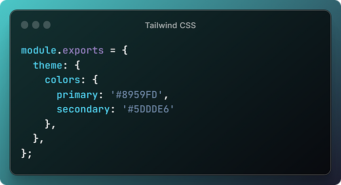
To use design tokens, you first need to create a set of tokens that represent the different design elements in your system. You can create the design tokens in the tailwind.config.js file. This is a good way to centralize your design tokens and make them available to all of your Tailwind CSS classes.
To set design tokens in the tailwind.config.js file, you can use the theme object. The theme object is a JavaScript object that contains all of the default values for the Tailwind CSS utility classes. You can add your own design tokens to the theme object, and Tailwind CSS will use them to generate the utility classes.
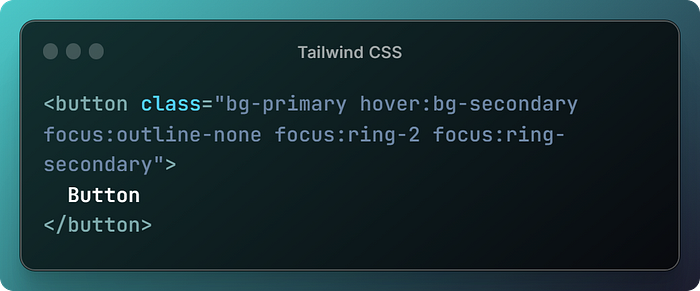
For example, the following tailwind.config.js file would set a design token for the primary color of the system,
Once you have set your design tokens in the tailwind.config.js file, you can use them in your Tailwind CSS classes just like any other Tailwind CSS utility class. For example, the following CSS would use the primary design token to set the background color of a button,
For more examples visit Tailwind’s documentation about themes.
Tailwind design tokens are like the building blocks of a beautiful website. They give you the power to create consistent, reusable, and scalable designs. So go ahead and let your creativity run wild! With Tailwind design tokens, the possibilities are endless.
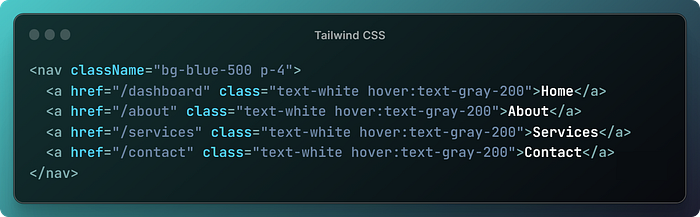
5. Don’t leave these in the dust.
Utility classes for responsiveness
Tailwind CSS provides a wide range of responsive utility classes that can be used to create responsive designs. These utility classes allow you to apply different styles to your elements based on the screen size.
To add a utility but only have it take effect at a certain breakpoint, all you need to do is prefix the utility with the breakpoint name, followed by the : character.
For example, if you want to change the background color of a button on medium and larger screens, you would use the md:bg-red-500 utility class,
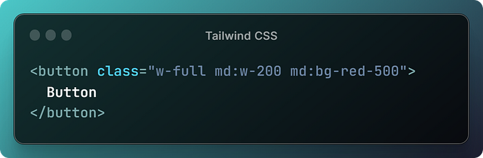
This allows you to be very flexible in making designs that work well on different devices. You can tweak just about anything when the screen size changes, even small details like the space between letters or the way the cursor looks.
Utility classes for dark mode
Tailwind CSS also provides a number of utility classes that can be used to create dark mode designs. These utility classes allow you to apply different styles to your elements based on the user’s dark mode preference.
For example, the following CSS code would create a button that has a different background color in light mode and dark mode,
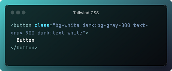
The bg-white class will make the button have a white background color in light mode. The dark:bg-gray-800 class will make the button have a gray background color in dark mode. The text-gray-900 class will make the button have black text in light mode. The dark:text-white class will make the button have white text in dark mode.
Like a wizard with a wand, unleash your creativity with Tailwind CSS utility classes! These versatile tools can transform your website or web application into a masterpiece, no matter your skill level.

Wrapping up
Now we have come to an end. As I promised, now it is the time to reveal the ultimate secret to ordering your Tailwind CSS classes. It is Headwind, a Visual Studio Code extension that sorts your classes automatically.
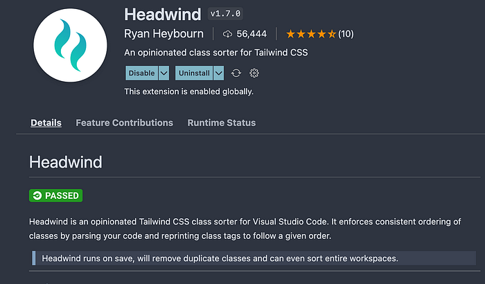
Headwind is like the third wheel that you didn’t know you needed. It’s always there for you, helping you to keep your code organized and efficient. So if you’re serious about using Tailwind CSS, get Headwind today. You won’t be disappointed.
And that’s all there is to it, folks! with these best practices, you’re now a Tailwind CSS ninja. Go forth and create beautiful and responsive websites and web applications!
Reference pages

